The user interface design of a game is crucial, in a number of ways: it must entice the user to do what feels natural within the game, while not calling attention to itself. It must develop and nurture empathy in the player for the theme of the game. It must support the decisions that make up the gameplay in the proper priority.
No game ever gets the UX/UI right first thing. It must be iterated upon and user tested repeatedly over the course of development: as development suggests design changes, the UI must respond each time.
IC went through much design change and experimentation, and there were many UI designs over the course of development.
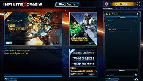
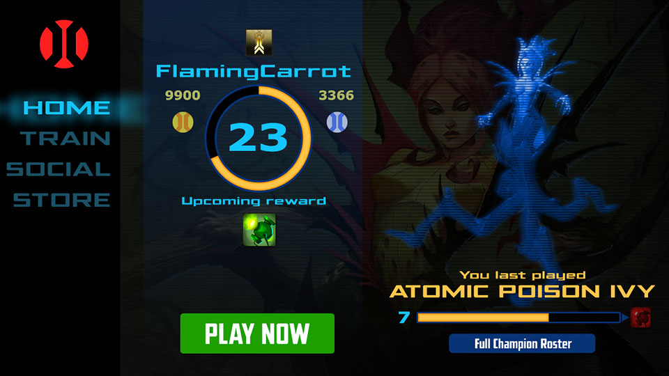
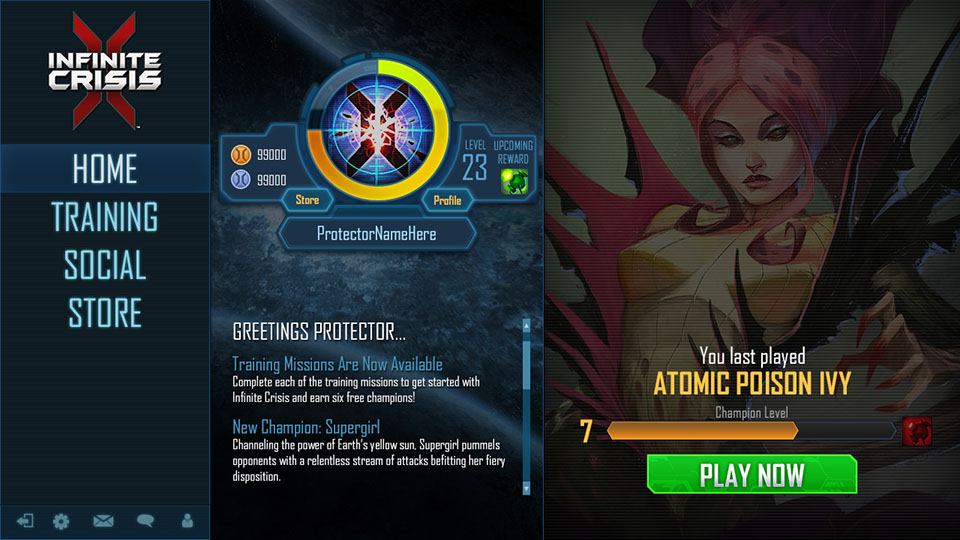
Versions 1 and 2 of the client home page during early development.
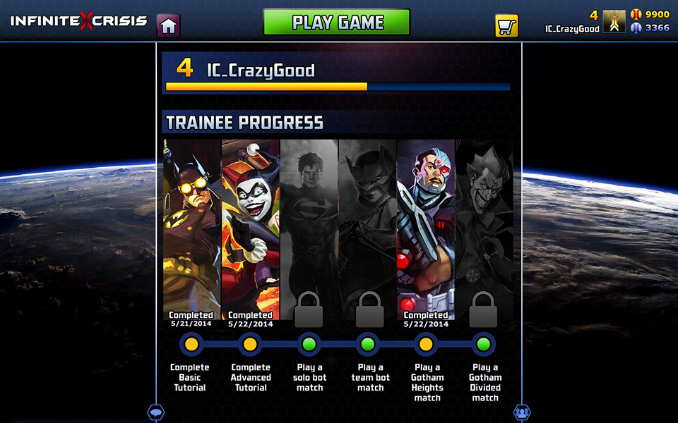
Below are some additional user interface design explorations, for the new user home page, and the veteran user home page.
As part of preparing for the last open beta update prior to launch, we engaged in a major overhaul of this UI experience, and worked up dozens of proposals. The UI team, the web team, developers, and I all worked up several ideas apiece, and we went through a long evaluation process together to arrive at the final design.
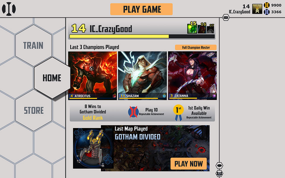
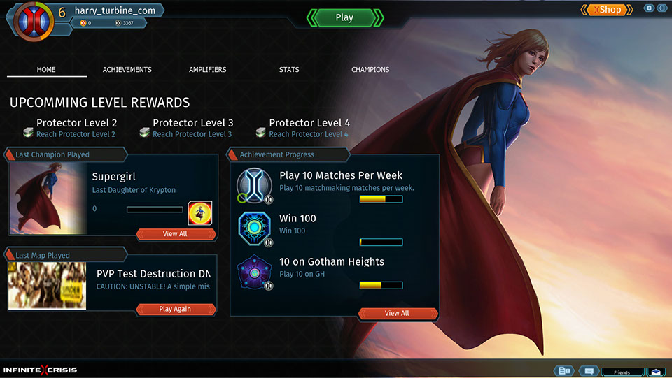
The launch version of the client home page. The goals here were to show off the character portraits, to show the player their account progress along a few different ladders, to show the upcoming rewards for leveling their account, and to make going into the game or store visibly obvious choices.
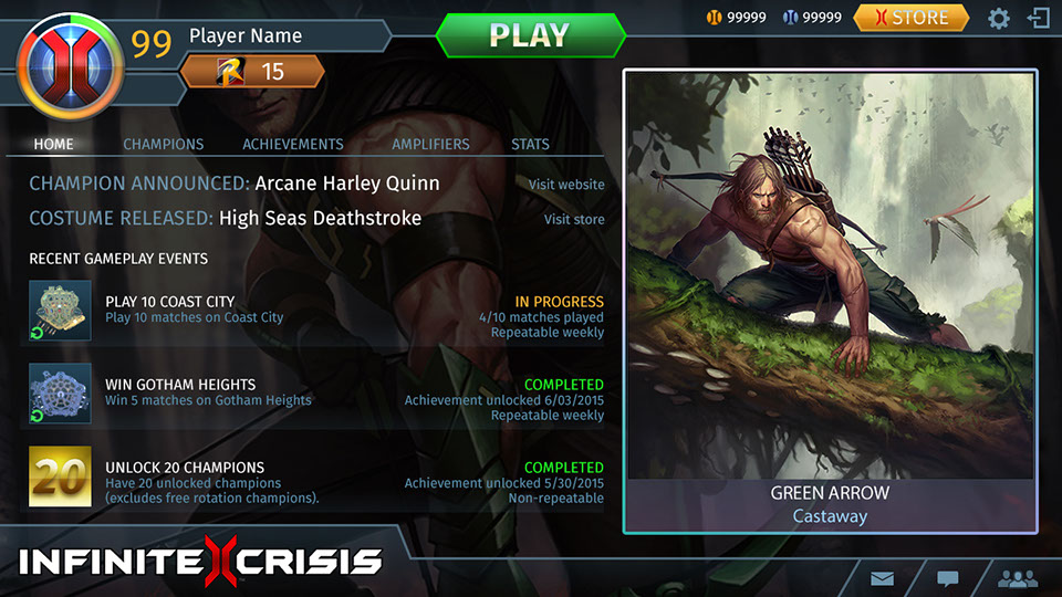
My proposed polish update for the client home page. After assessing the launch UI, there are several modifications here to bring the page further forward:
1. Costume art is shown off, for the last played champion/costume, instead of only showing the base appearance of each champion. Base character portrait becomes a full subdued background, instead of a square on the right side that fades to black: this fixes the appearance of several different pages that use this same background template. Champion rank, a new feature, is shown with a border around the portrait, here showing Green Arrow to be of diamond rank.
2. More polish on buttons to make them more attractive and noticeable. A new feature, Player Rank, is shown in the player widget in the upper left, showing this player to be Rank 15, a Bronze-level rank.
3. Reduced framing clutter around various elements. Reduced the overabundance of hex shapes and rectangles.
4. Reduced overall information delivery to those items that players most care about. Introduced website and store news to drive awareness.
The user interface is critical to attracting a player and helping them stick. It is my firm belief that it is nigh-impossible to devote too much time and effort to a game's UI.
MORE INFINITE CRISIS
The following page shows examples of the character art for the in-game avatars.