
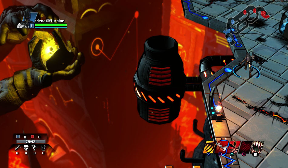
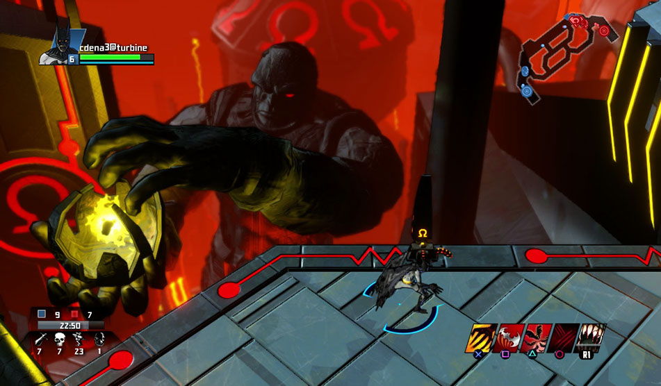

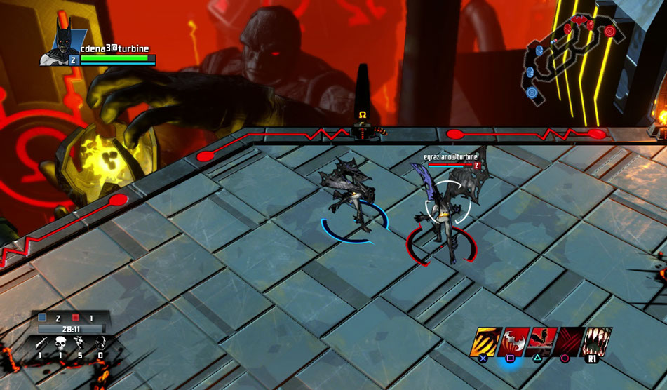
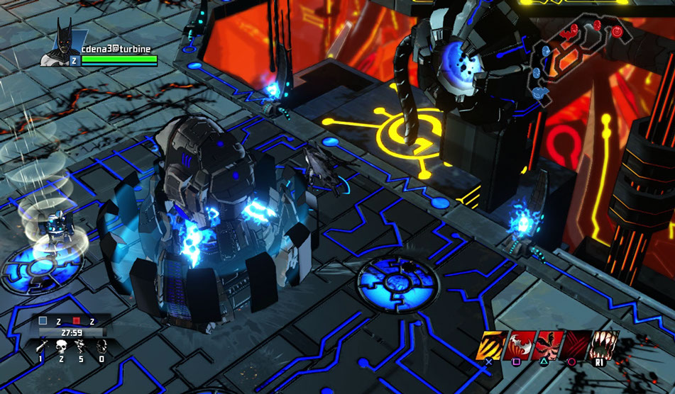
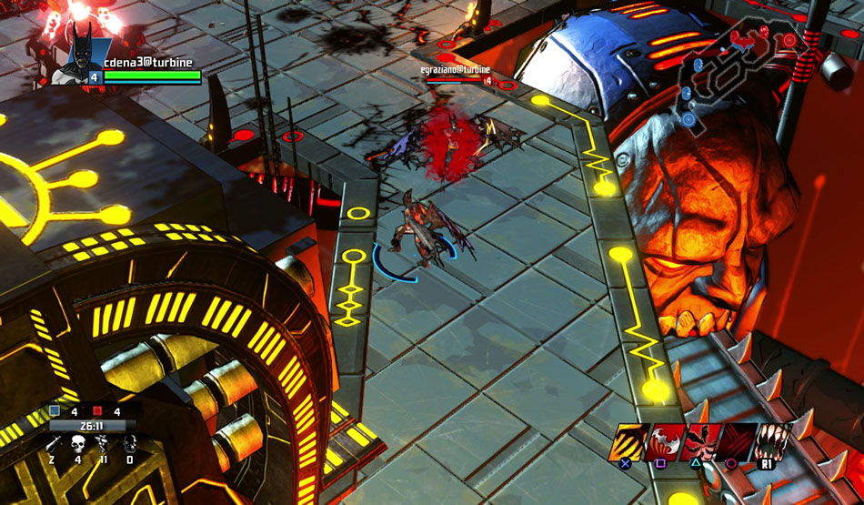
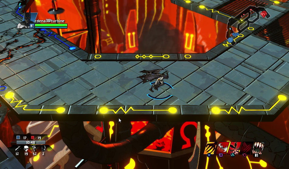
The initial visual design of IC was more straightforwardly comic book in tone. A chiaroscuro ink style, with heavy black shadows, combined with a vibrant color palette, was the goal, which we produced very effectively for the first iteration of the game. Textures were simple and stylized. Shadows are stark, sharp-edged and black, and colors are rich. Memory footprint was low, performance was high, and the game evoked comic books in a unique way.
The prototype map took place on Apokolips, home of Darkseid. The map was a set of walkways suspended over the fiery techno-hell of Darkseid's seat of power. The playable game areas were cool in tone, contrasting with the warm colors of the background space.
We did not proceed with the comic style, as it was deemed too close to the various DC animated series' art style, that are targeted at a younger demographic. With further design review, and a reconcept on visual style, IC reemerged as a primarily single-player/coop adventure game, somewhat like Marvel: Ultimate Alliance in feel.
We were asked to go realistic with the visuals. Given the tight memory budget of the game, it presented a challenge to work within our engine to produce a realistic, detail-accountable world, and still run acceptably. We went with dyemaps and secondary colormaps to hide the significant reuse of the main diffusemaps, to give the world the necessary variety while being efficient and performant.
We went to Gotham City in the Gaslight Universe to prototype this version of the game.
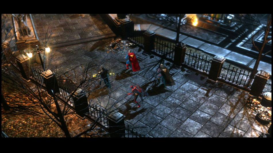
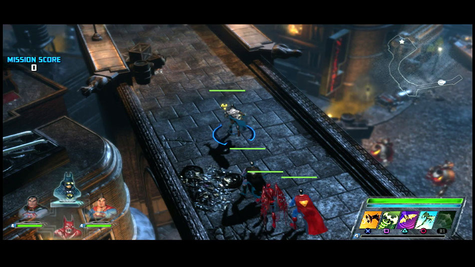
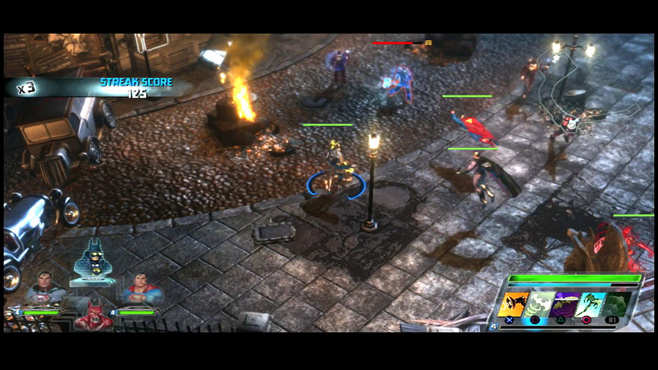
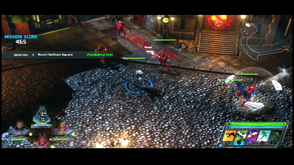
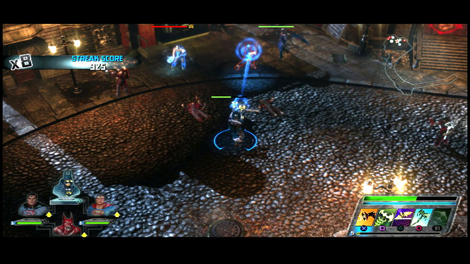
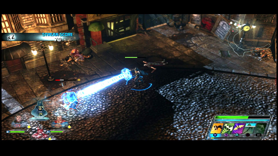

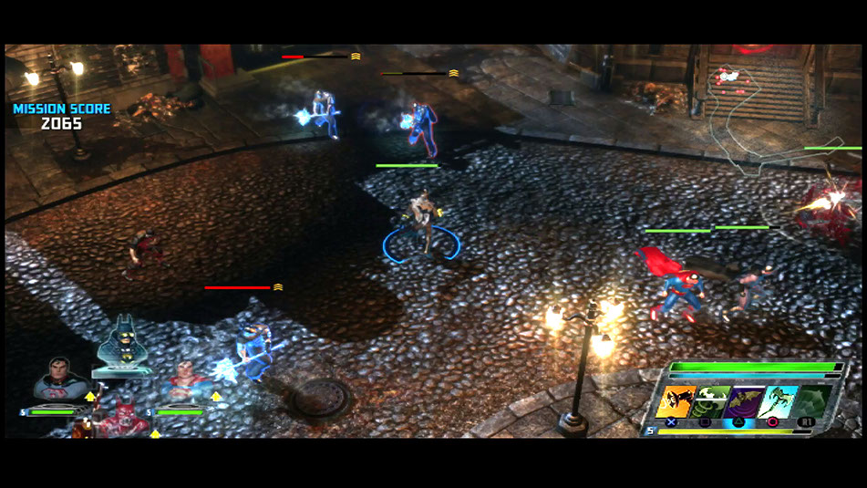
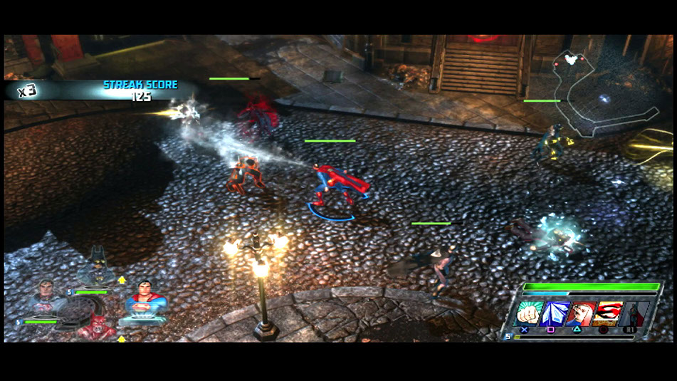
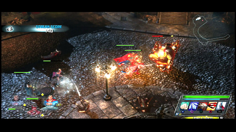
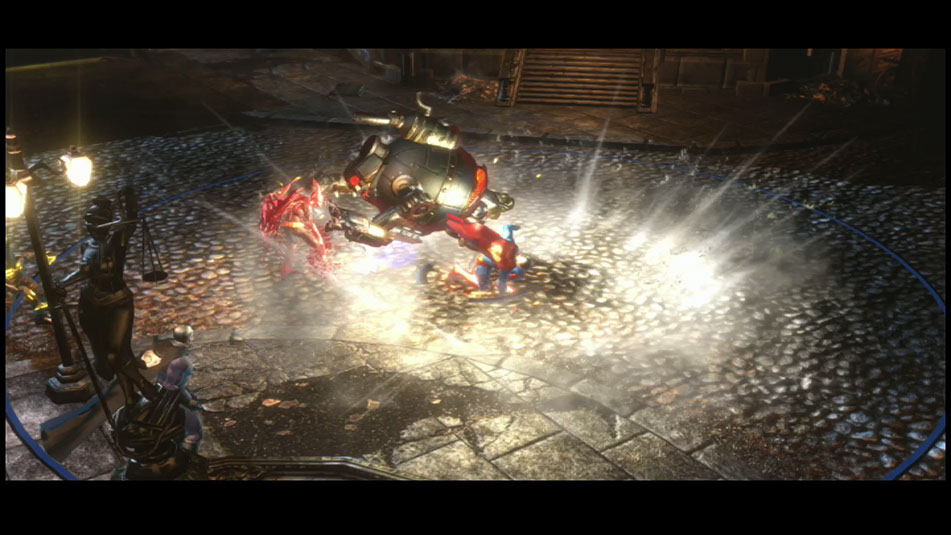
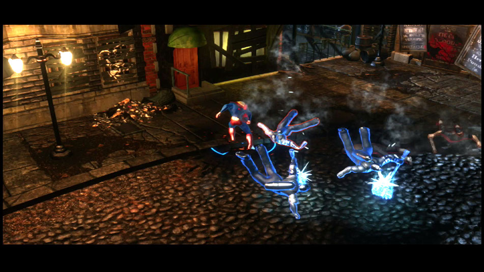

This version of the game was greenlighted for production. However, development constraints forced us to move away from single-play/coop play, being generally more content heavy, and our staffing did not permit us to build as much as would have been necessary.
By this time, the MOBA genre was more well-known, and so it was finally agreed that doing IC as a MOBA game made sense.
MORE INFINITE CRISIS
The next page shows various user interface explorations, with the final interface design, with how I provide polish feedback.